Table of Contents:
- What Does “Mobile-Friendly” Mean?
- Examining the Data: Mobile Device Use in Web Searches
- How Does A Mobile-Friendly Website Help My Practice Grow?
- Best Practices
- Final Thoughts on Mobile-Friendly Web Design
-1.png?width=512&height=288&name=unnamed%20(4)-1.png)
In a world where technology is constantly evolving, the importance of mobile-friendly medical website designs cannot be overstated. Consider this—the world is inhabited by an estimated 7.1 billion mobile users, or a staggering 91% of the global population. Furthermore, tablet users recently crossed the 1 billion mark.
These numbers are only set to increase in the coming years, and they illustrate a pivotal shift in the way people around the world access the internet. Now, more than ever, a mobile-friendly website is not a luxury, but a necessity for any medical practice looking to stay relevant. 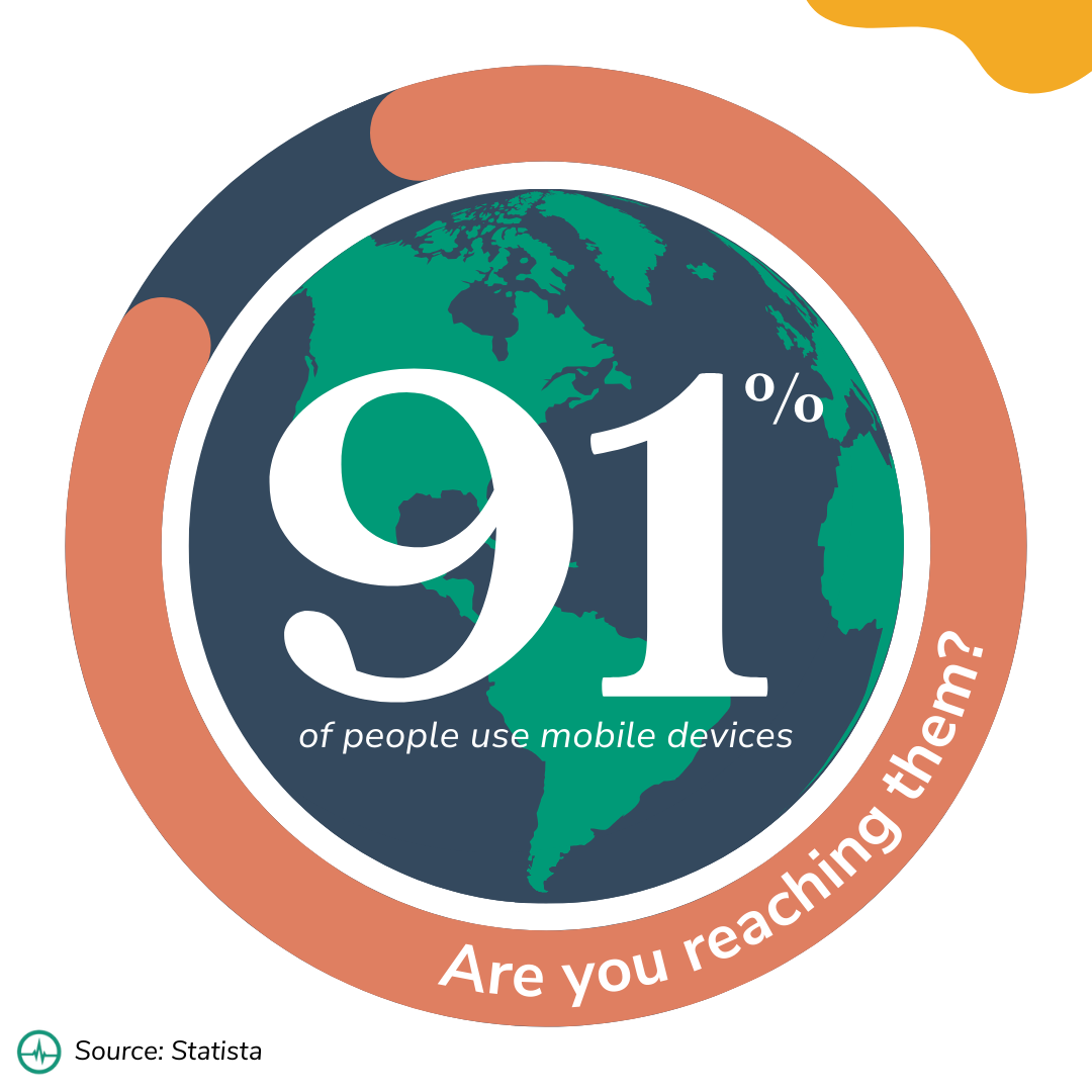 Responsive web design ensures that your site is accessible and convenient for the vast majority of the population, offering a significant competitive edge in the dynamic healthcare landscape.
What Does “Mobile-Friendly” Mean?
"Mobile-friendly" refers to a web design approach that ensures your website is fully functional, easily navigable, and visually appealing on a mobile device, including smartphones and tablets. Because screen size can vary greatly among different devices, a responsive and mobile-friendly design adapts and adjusts the layout of your website to fit any screen size. This results in text that is readable without zooming, clickable elements that are adequately spaced, and images that are properly sized and optimized for mobile viewing.
By ensuring your medical practice's website offers an optimized experience across all mobile devices, you cater to a broader audience and make your services more accessible. It's not just about staying current with technology; it's about providing the best possible patient experience, no matter how they choose to access your website.
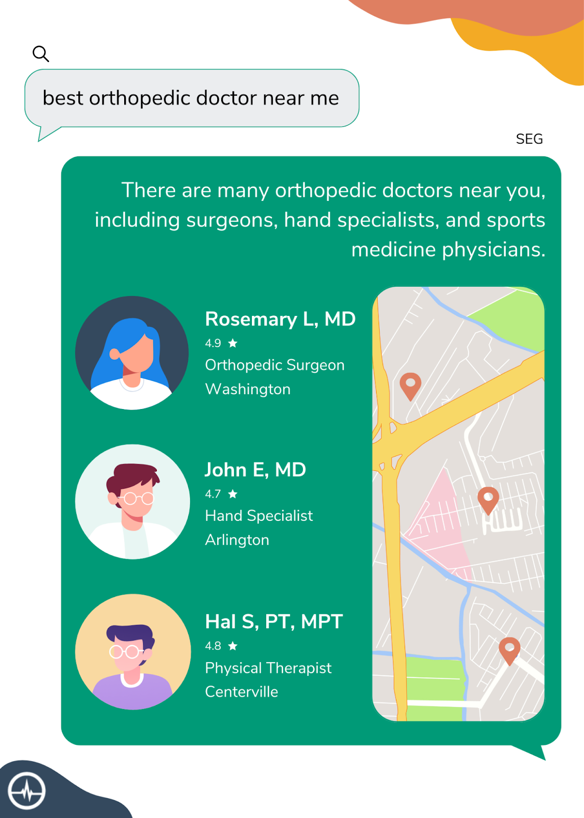
However, it's important to note that patients aren't simply looking for websites anymore. With artificial intelligence (AI) becoming more prominent in the digital landscape, the face of traditional search is changing. No longer limited to typing keywords into a search bar, users can now interact with AI-powered search engines much like they would with a human expert, asking complex questions in natural language and receiving accurate, contextual answers in return.
These AI-powered search engines, also referred to as Search Generative Experiences (SEG), are becoming increasingly popular. Imagine a patient asking, "Who is the best orthopedic surgeon near me?" and receiving a clear, conversational response that names your practice. By optimizing your website for mobile viewing and incorporating SEO strategies to increase visibility on these SEGs, you can ensure that your medical practice is easily discoverable by patients looking for your services.
 If your website isn't mobile-friendly, it could be costing you thousands of potential patients. The harsh reality is, that no matter how top-tier your medical services are, if your web presence isn't up to modern standards, you're losing out on potential patients.
That's where the PracticeBeat platform, developed by Treatspace, can help. PracticeBeat ensures that your website is fully responsive, visually appealing, and easy to navigate, with a design that automatically adjusts to fit any screen size. It caters to the needs of the modern patient, offering a seamless online experience that matches the high-quality care you provide in person.
Examining The Data: Mobile Device Use In Web Searches
It's not just about being accessible to patients; it's also about driving traffic to your website. As mentioned earlier, mobile device usage has significantly increased in recent years, and this trend is reflected in statistics about potential patient's behavior on the internet.
Consider the following data:
- Across the globe, mobile devices account for 58% of all website traffic.
- In the United States, mobile devices account for 63% of organic search engine visits.
- People with access to the internet spend around 57% of their time online using a mobile device.
- 74% of people are more likely to return to a mobile-friendly website.
- 65% of smartphone users have used their mobile phone to research a health condition
In other words, having a mobile-friendly website is not only essential for attracting new patients, with a majority of people spending a majority of their time online on their mobile devices, but it's also crucial for retaining current ones.
Moreover, since March 2021, Google has been using "mobile-first indexing." This means that Google primarily uses the mobile version of your website for indexing and ranking, rather than the desktop version. So, if your website isn't optimized for mobile devices, you may be losing out on search engine visibility as well.
How Does A Mobile-Friendly Website Help My Practice Grow?
Having a mobile-friendly website has numerous benefits for your medical practice. By optimizing your web presence for mobile devices, you can:
Improve Your Site's PSI
PSI stands for PageSpeed Insights, a tool developed by Google to help website owners measure the performance of their web pages. PSI scores a page's speed and user experience on both mobile and desktop devices, providing a detailed report and actionable recommendations for areas of improvement. A high PSI score indicates that your website is well-optimized and loads quickly, contributing to a positive user experience.
A fast, responsive site leads to higher user engagement, retention, and conversion rates. Patients are more likely to stay on and return to a site that loads quickly and is easy to navigate. Moreover, Google considers site speed as a ranking factor in its search algorithm, meaning a faster website can result in higher visibility in search results. By optimizing your website's performance and achieving a high PSI score, you can improve your site's user experience and potentially attract and retain more patients.
Ensure Your Website Has Good UX
User experience (UX) is crucial when it comes to retaining patients and attracting new ones. A user-friendly website can lead to better patient engagement, improved satisfaction, and higher conversion rates. By optimizing your medical practice's website for mobile devices, you can provide a seamless online experience that reflects the quality of care you provide in person.
Moreover, for practices that allow their patients to schedule online, providing an easy-to-use mobile interface is even more critical. With a user-friendly mobile site, patients can easily find the information they need and book appointments on the go, increasing convenience for both parties. After all, the easier it is for patients to schedule appointments online, the more likely they are to do so.
Strengthen Your Site's SEO Impact
Google's algorithms have always aimed to mirror user behavior, and with the surge in mobile usage, it's no surprise that mobile-first indexing has become the norm. This means that having a mobile-friendly website is crucial for your website's ranking on search engine results pages (SERPs).
With mobile-first indexing, Google assesses your site based on its performance and user experience on mobile devices. Factors like load speed, site design, and ease of navigation on smaller screens can all impact your rankings. By optimizing your website for mobile use, you not only cater to your user's preferences but also align your site with Google's ranking factors.
Best Practices For A Mobile-Friendly Website
Creating a mobile-friendly, HIPAA-compliant, optimized web design involves a strategic blend of design, development, and compliance considerations.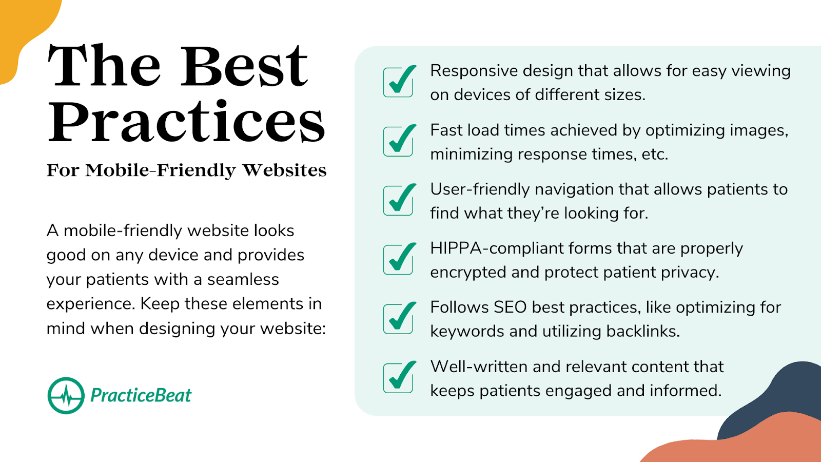
- Responsive Web Design: The cornerstone of a mobile-friendly site, responsive web design ensures the site's layout adjusts seamlessly to the screen size of the device it's viewed on. This allows for optimal viewing and interaction, with a minimum of resizing, panning, and scrolling.
- Fast Load Times: Users expect websites to load quickly, particularly on mobile devices. Optimizing images, leveraging browser caching, and minimizing server response times can help achieve this.
- User-Friendly Navigation: A well-organized site structure with clear, concise navigation menus allows users to find the information they're seeking effortlessly, enhancing overall user experience.
- HIPAA-Compliant Forms: To comply with HIPAA regulations, any forms that collect protected health information (PHI) must be HIPAA compliant. This means data must be encrypted in transit and at rest, and the web server must have a business associate agreement (BAA) in place with all vendors that handle PHI.
- SEO Optimization: Your site should follow SEO best practices, from keyword-optimized content and meta tags to a solid backlink profile. Remember, mobile optimization is a significant factor in SEO, so a mobile-friendly design is crucial here too.
- Content Quality: Finally, high-quality, relevant content is key to keeping users engaged. Ensure your content is informative, well-written, and crafted with both your audience and search engines in mind.
By combining these elements, you can create a website that's not only an effective marketing tool but also a valuable resource for your patients. However, digital medical marketing is an ongoing process, and regularly reviewing and optimizing your website's performance is essential for continued success.
Implementing these best practices involves a significant amount of work and expertise. Navigating this digital landscape can be challenging, especially as a medical practice focused on providing top-tier services.
The real best practice? Leave the complexities of digital medical marketing to the experts. At PracticeBeat, we specialize in crafting mobile-friendly, HIPAA-compliant, and SEO-optimized websites that reflect the quality of your medical practice. With our comprehensive digital marketing solutions, you can focus on what you do best: caring for patients.
Final Thoughts On Mobile-Friendly Web Design
In the evolving landscape of healthcare, having a mobile-friendly website isn't just a convenience—it's a necessity. With more and more people using their smartphones for all aspects of their lives, ensuring your website is optimized for mobile use is crucial to remain competitive.
By following industry best practices and seeking the services of a reputable digital marketing partner, you can establish a seamless user experience. This will help your website not only reach patients, but also ensure their long-term loyalty and satisfaction. With a user-centric approach and strategic implementation, you can foster long-lasting doctor-patient relationships and drive sustainable growth for your practice.
Ensure your medical practice doesn't get left behind. Optimize your website with Treatspace's PracticeBeat platform, and make your services more accessible, more visible, and more successful.
Don't let the competition leave you behind. Let PracticeBeat begin by preparing a detailed assessment of the top performers in your market and specialty. We will show how you perform, share insights into your performance, and tell you how to outperform your competitors. Sign up for a free assessment and demo today or visit our website to learn more.